Gamifying upsell at Yango Play
2026 · Design Direction
Yango Play is the streaming product I lead design for — video, music, and games for users across
the GCC and beyond. The annual subscription tariff is one of the highest-leverage conversion
goals on the product, and the team had been hitting a ceiling on it for months.
This case is design I directed but didn't author. Denis Shumov owned the
project end-to-end as a Sandbox initiative — concept, exploration, motion, prototyping,
and ship. He drove the entire visual production through Krea.ai,
which is the part of this story that mattered most for delivery. My role was the
framing, the call on what to ship, and unblocking. The craft below is Denis's.
What we already had
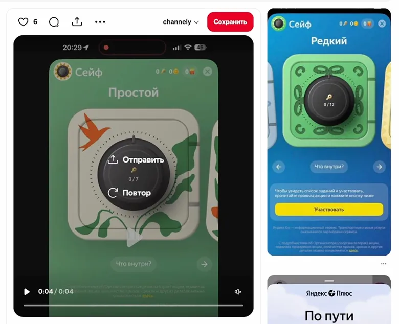
Yango Play already runs five communication formats in production: Tour Updates,
Fullscreens, Promo Bottom Sheets, Micro Promoblocks, and Notifications. They cover the
full surface of how we talk to users — first-launch tour, fullscreen takeover, in-feed
nudge, and out-of-app push.
Our annual tariff sat behind these surfaces, and the team had iterated on them hard.
CTR, engagement, and conversion were all tracked. The number that mattered — annual
tariff subscriptions per month — had plateaued.
~1,400
Annual subs / month, plateau
5
Static comm formats already in production
Why we needed something else
Our existing interactive tool — Wheel of Fortune — was the proven lift driver. But it
was on another track and would not be ready in time for Ramadan. Ramadan was four
weeks out, and Ramadan is the conversion moment for our GCC audience. The annual
tariff has to land then or it doesn't land at all that year.
Two converging facts: the existing static formats had stopped scaling, and the
interactive tool we'd built before wouldn't ship in time. We were scrolling past our
own promos at the same sale points users were — that's the truthful read of the
ceiling. The ask was a worthy interactive replacement, designed and shipped in four
weeks, on three platforms — Android, iOS, and TV.
February 2026
Ramadan starts Feb 17
Sun
Mon
Tue
Wed
Thu
Fri
Sat
1
2
3
4
5
6
7
8
9
10
11
12
13
14
15
16
17
18
19
20
21
22
23
24
25
26
27
28
Kickoff · Jan 20 Ramadan · Feb 17
The hypothesis
Interactivity and motion would beat static because they'd buy the user's first three
seconds. Three seconds is a lot in promo time — long enough to read the offer, long
enough to convert. The lift wouldn't come from a lower price. It would come from
keeping the user present.
The offer was sized for that frame. An annual tariff is roughly 265 paid days; the
promo adds 100 free days on top. Same money in, more days delivered — and it's sold as
a gift, not as a discount or a cheaper monthly. "You won 100 days" reads
completely differently from "save 30%."
Five principles
Denis pulled five principles out of our previous wheel-of-fortune learnings and the
static-promo data. Everything below was in service of one of them.
Proactive interest, not popup interruption
Promos that pop up unexpectedly compete with what the user came to do. A special
project — something the user opens on purpose — has the user's attention from the
first frame.
Sell the emotion of winning, not the discount
"Save 30%" is forgettable. "You won 100 free days" is a story.
One strong simple image survives any implementation
If the central idea is cohesive, it'll work as a static banner, a motion fullscreen,
and a TV spot. If it isn't, no amount of animation saves it.
Time invested = engagement earned
A scratch, a shake, a tap-to-reveal — the small mechanical action turns the user
from audience into participant.
Intrigue beats immediate reveal
A covered prize is more interesting than a visible one. The 1.5 seconds of "what is
it" do more for engagement than the prize itself.
Verification criteria
Generation is endless. Anything can be turned into a mechanic. So we set four criteria
for whether a mechanic was good enough to ship — anything that failed two of them was
cut.
Simple, 1 tap
Anything more than one mechanical action and we lose the user before the reveal.
3-second retention
Either interactive or animated content has to hold attention for the first three
seconds — to widen the top of the funnel.
Cultural and visual fit
Reads as Ramadan-flavored. Fits Yango Play's media context. Uses our visual language.
Connection to content
A scratch over a generic surface is a discount. A scratch over a film genre is a media
product.
Exploration, run through Krea.ai
The working method matters more here than any single artifact. Denis ran the entire
visual exploration through Krea.ai — image, motion references, and full-fidelity
moodboards for every direction we tested. That's how we got from "we need a Ramadan mechanic
in four weeks" to a finished motion-driven promo without a dedicated video team.
The catalog of mechanics tested:
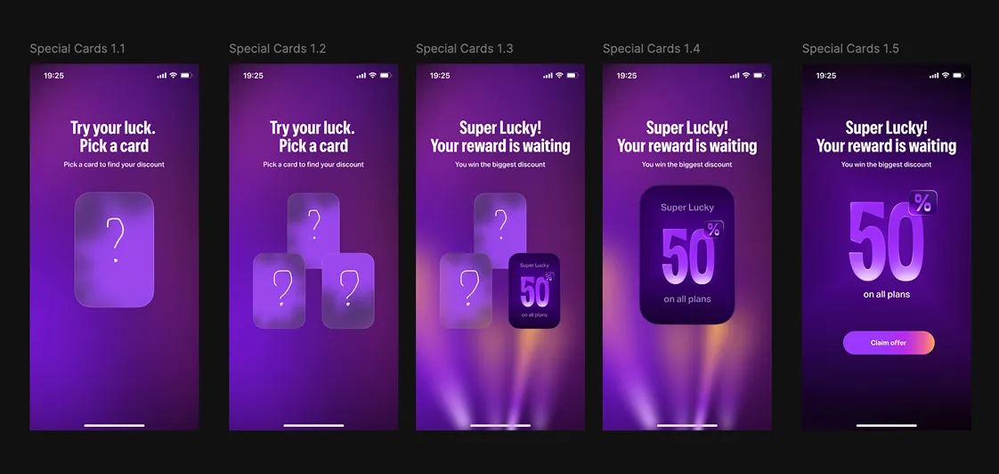
For each direction, Denis generated a complete visual treatment in Krea — not a
sketch, not a wireframe, a high-fidelity moodboard with motion references — in under
an hour. Six directions in a day. That speed is what made the exploration possible
under the timeline at all. With a traditional pipeline (concept → static moodboard →
motion brief → AE comp → review) we'd have spent the four weeks just exploring.
The interesting shift wasn't the AI itself — it was that the production line
compressed enough for
one designer to operate the whole thing. Concept, motion, prototype, and ship, in one head, in four weeks.
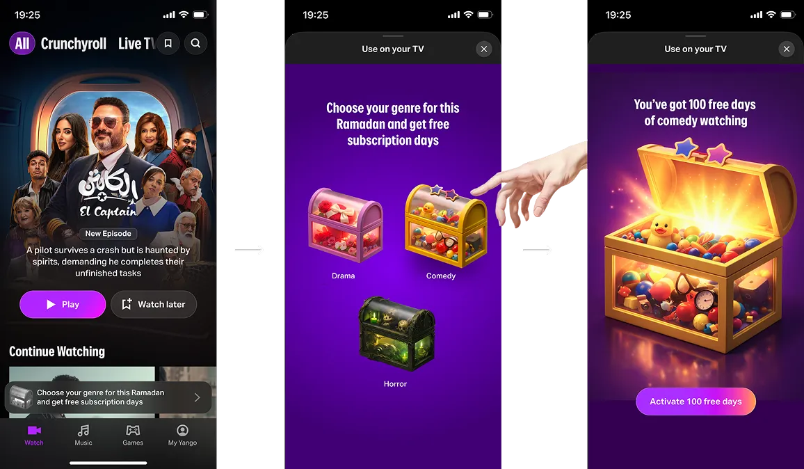
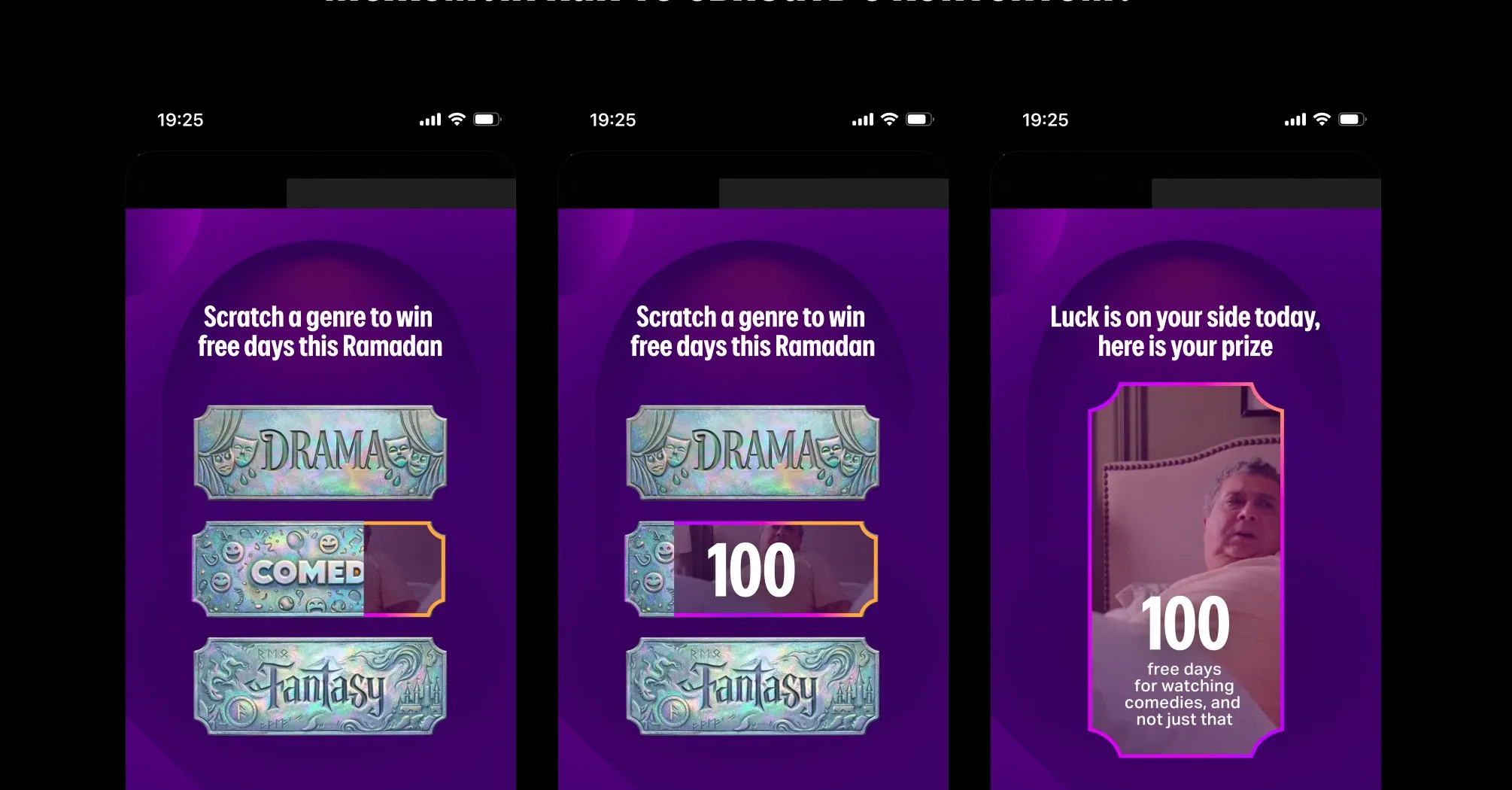
Tying the mechanic to content
A scratch over a generic surface is a discount. A scratch over a film genre is a media
product. So we ran a round where the surface itself was a Yango Play title — Drama,
Comedy, Fantasy. Same scratch action, same offer, but the prize is days of content the
user can already see on the catalog.
Tech decision
Two production options on the table.
Figma + Lottie / Figmotion
Looked promising. Failed in production. After Effects supports 3D, blur, and
several effects that Lottie won't translate. Lottie components are hard to reuse
across promo iterations. TV runtime support is unclear and not battle-tested.
Webview + video
Mobile renders a webview with embedded video and a thin layer of interaction. TV
renders the video as a fullscreen. Trade-off: TV has no real interaction. We'd
come back to that.
Two finalists — and a pivot
We first narrowed to two mechanics, both built on the same central image — a magic
ball. Scratch the ball to reveal the prize, or shake/spin to trigger the reveal.
Familiar fortune-teller object, instant read across markets.
Then our regional partner Maysam flagged it. Magic-call imagery isn't appropriate in
the GCC market — culturally and religiously off. We had to find a central object that
wasn't a magic ball, and we had a few days to do it.
No the magic call is not appropriate
(Magic is against islam technically)
So we ned to find something othet than the ball
A few hours later — the lantern
Krea earned its keep here. Denis went back into exploration mode, generated dozens of
alternative central objects across an afternoon, and landed on the
Ramadan lantern (fanous) — a symbol that's iconic to the region, neutral
on religion, and visually richer than the ball ever was. Two interactions then ran in parallel:
spin the lantern and scratch the gold off it.
From all of that, two finalists earned the ship slot — both built on the same lantern,
both ending with the prize emerging from inside it. The difference is the mechanical
action and the surface state at frame one.
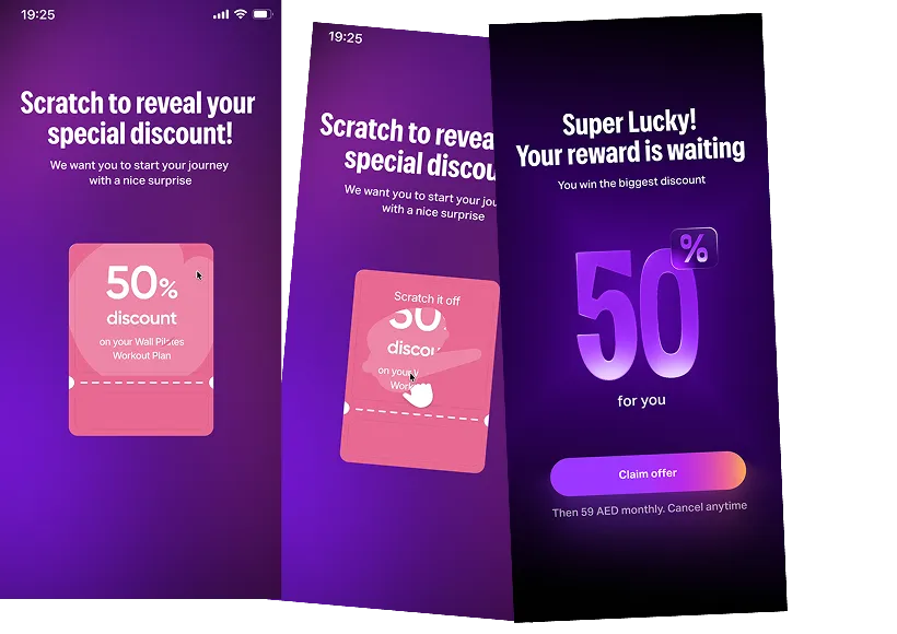
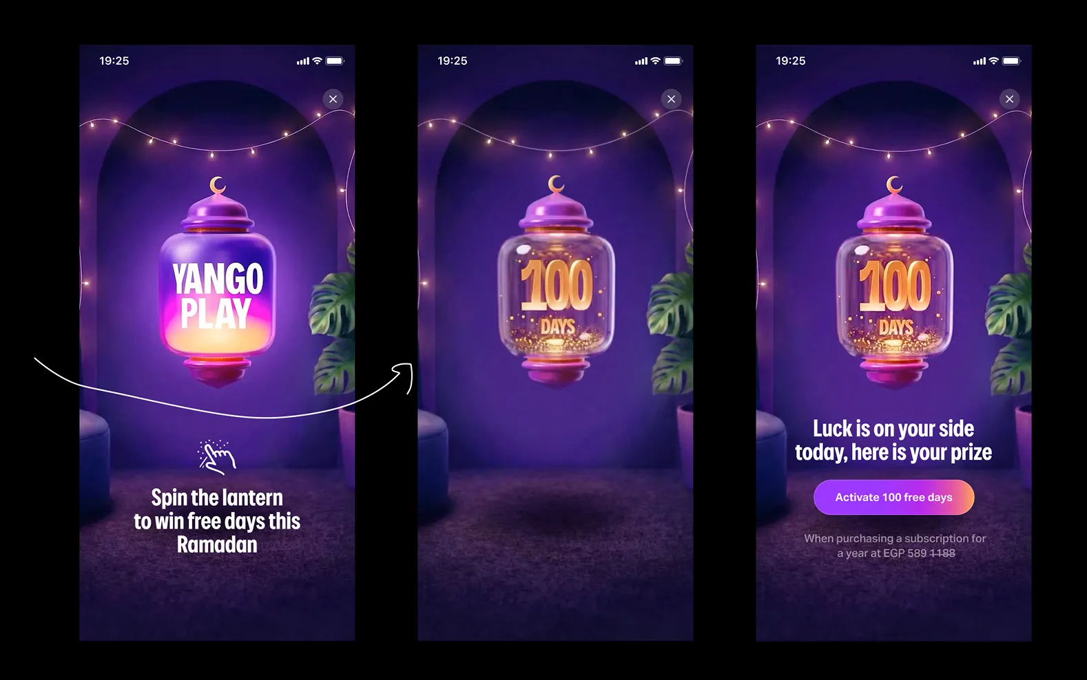
v1 — Spin the lantern. The lantern hangs intact in the centre, lit and
animated. The user spins it; momentum settles into the reveal of "100 days" glowing through
the glass. The reward feeling rides on the rotation arc.
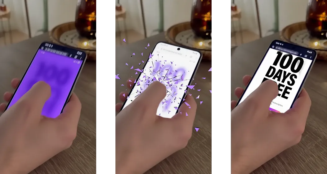
v3 — Scratch the gold. The same lantern, but coated in gold leaf with no
Yango logo on it. The user drags a finger across the surface; the gold erodes in real time
and the lantern emerges underneath. The brand and the prize both surface from under the
user's hand.
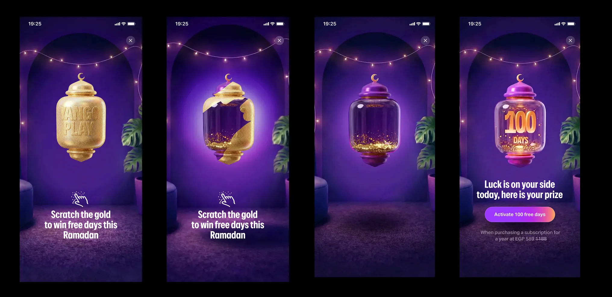
Scratch won the ship slot. It maps to a real-world action — everyone has scratched a
lottery ticket. Shake/spin doesn't have the same payoff intuition; you don't know if
you've spun hard enough, and the absence of clear cause-and-effect kills the reward
feeling. Logo removed from the gold layer because the brand had to emerge
from under the user's finger, not greet them at the start.
The shipped flow
Two-line copy. One CTA. No ladder. The mechanic takes about three seconds end to end.
1 — Open
User opens the promo on purpose (proactive). Lantern hanging in the centre, gold
surface intact, ambient Ramadan motion, prize hidden underneath.
2 — Scratch
Finger drags across the gold. The scratch surface erodes in real time, lantern glow
leaking through. Haptic tick on each pixel uncovered.
3 — Reveal
"100 free days." Confetti. The CTA appears underneath: Activate now.
4 — Activate
Tap drops the user straight into the annual tariff flow with the bonus already
applied. No re-confirm step.
Results
Shipped in four weeks. Three platforms. The results split cleanly by platform — and
the split was the most interesting part.
+34%
Android CTR, Egypt
+38%
Activations, Egypt
~3.2s
Median time to prize
Android — strong lift. CTR and activations both up in Egypt, the primary
Ramadan market. The mechanic worked exactly as the principles predicted.
iOS — analytics still settling. A handful of tracking bugs masked the early
numbers. Likely positive once corrected, but we don't quote a number until we trust it.
TV — the surprise. Test group clicked less than control.
Fake scratch on a TV — where the user has no finger on glass — performs worse than no mechanic at all. We thought we were giving TV users a unified experience. We were giving them a
reminder that the experience is meant for somewhere else.
Plan from here on TV
Three things on the next sprint:
Audit CTA delay
Is the Activate button drawing too late after the video loads? On a TV that delay
compounds — the user has already moved on by the time the affordance appears.
Test offer copy
Maybe the prize isn't reading. The 10-foot context cuts how much copy lands.
Drop the gate
The principle says intrigue beats reveal — but only if the user can act on the
intrigue. If they can't, the principle inverts. Skip the scratch on TV and show the prize
at frame one.
The pipeline is the real output
The Ramadan promo was the visible output. The reusable webview pipeline — the one
Denis built around Krea.ai as the visual layer — is the meta-output, and the more
valuable one.
A reusable production stack
Krea-generated motion goes into a templated webview. Three platforms, days not
weeks, no video team required.
A tested principle set
Five principles and four verification criteria that travel to any future campaign —
Eid, anniversary, regional launch. Generation is bounded by criteria, not by taste.
A real datapoint about TV
Tactile mechanics don't translate to TV. Don't fake them. Every campaign after this
one starts with this constraint already known.
My takeaway as design director
The interesting story for me was watching how much of the production line could be
operated through Krea.ai by a single designer with motion fluency. Concept, motion,
prototype, and ship — one head, four weeks, three platforms.
That's the shape of the design work going forward. The team's job stops being "produce
assets" and starts being "set the principles, choose the criteria, and decide what
ships." This case is the first time I saw that work end-to-end on the team I run.