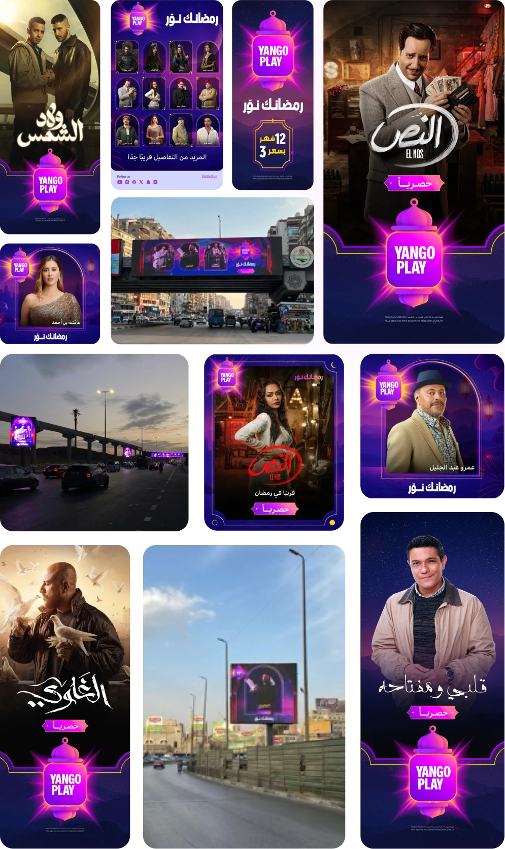
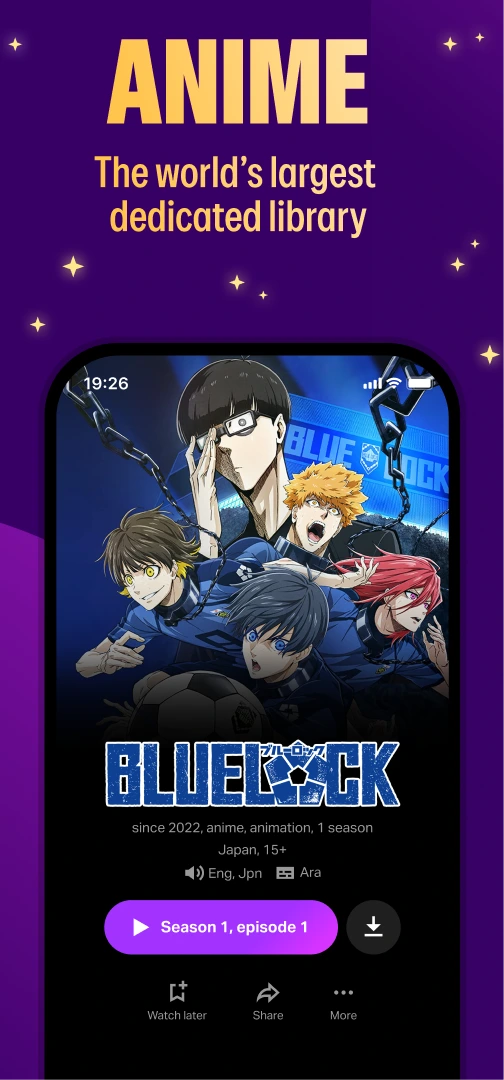
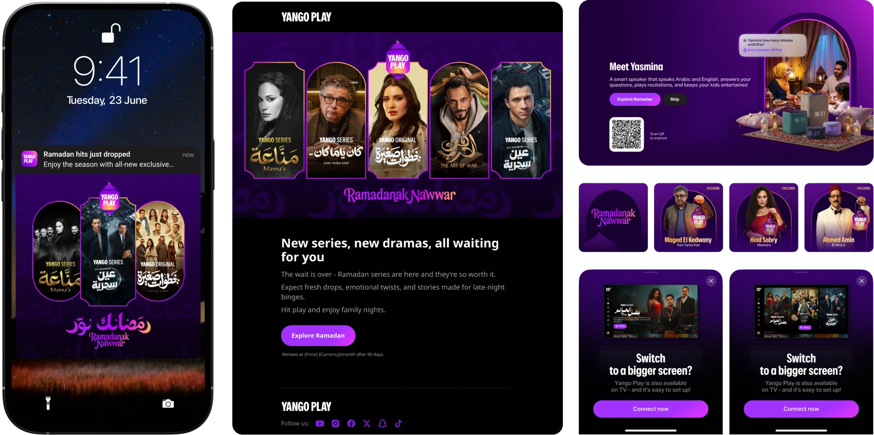
What I led— rebuild of the Ramadan brand system for year two.
What shipped— lantern, tagline, arched-window layout, fortune-wheel interaction engine, plus
seasonal in-app rollouts across Yango Play and Yango Music.
What worked— 75% of an aggressive subscriber KPI · +33% revenue YoY · +253% watch time · +27.5%
Spiritual showcase usage.
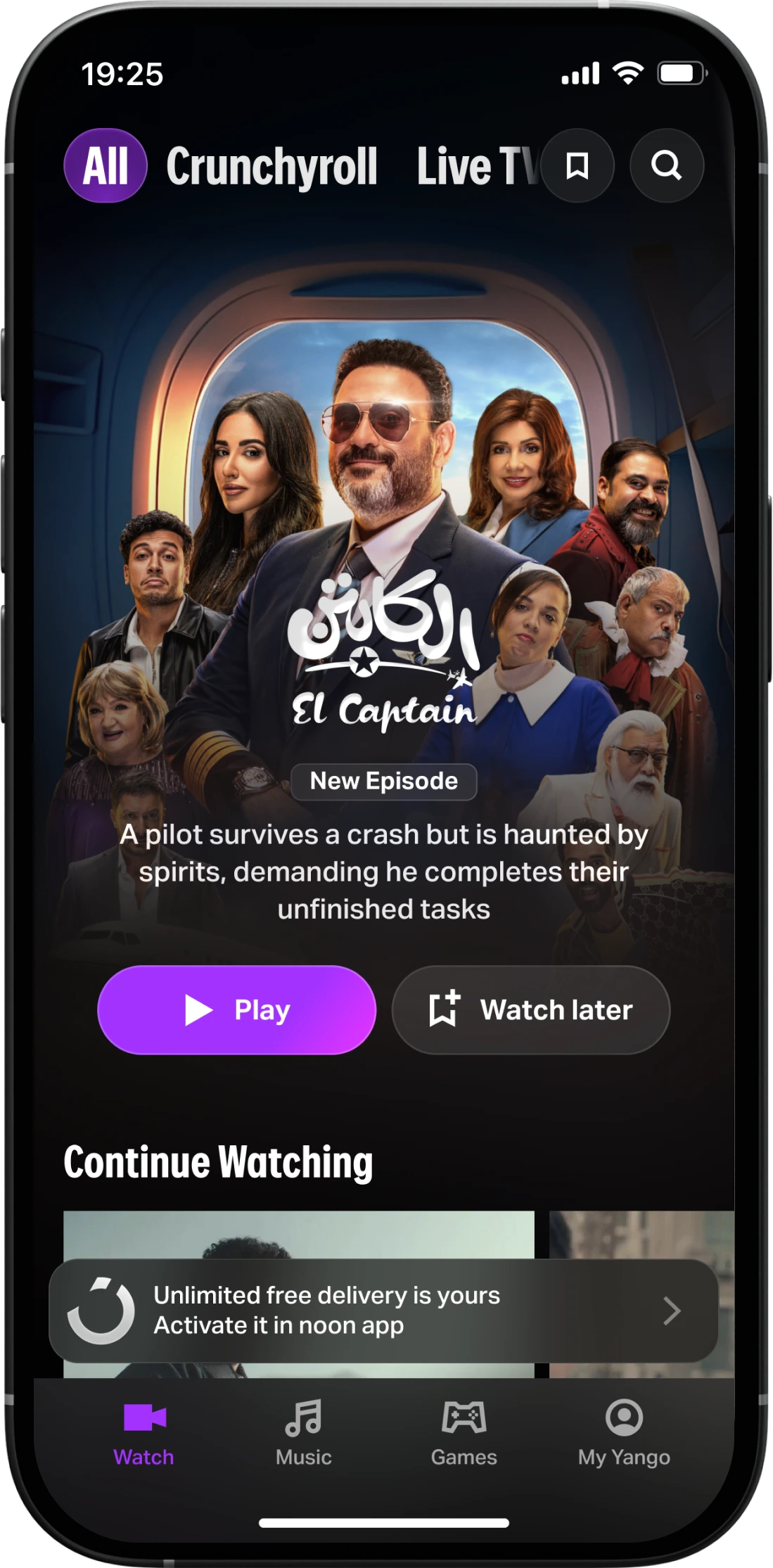
I'm Head of Product, Brand & Content Design at Yango Play — leading a 20-person design org across product, brand, and content for the Yango entertainment
ecosystem in MENA — streaming, music, games. Ramadan is the highest-stakes window of the
entertainment year in the region — the month when every platform commits its strongest content,
its biggest brand push, and its peak ad spend. We compete on two fronts simultaneously —
content lineup, and brand visibility next to MBC, Shahid, and Netflix.
2025 was the first time we showed up at full campaign scale. The campaign —
Cultural Takeover: Yango Play in Ramadan, MENA — took bronze at the
TikTok Ad Awards in the Big Branding Event category. We were happy, and
we were also not satisfied — the layout was too rigid, the logo didn't survive the move
to outdoor, and consistency drifted as more titles and partners landed.
2026 was the rebuild. This case is mostly the system-level decisions I drove, with
credit to the people who authored each part below.
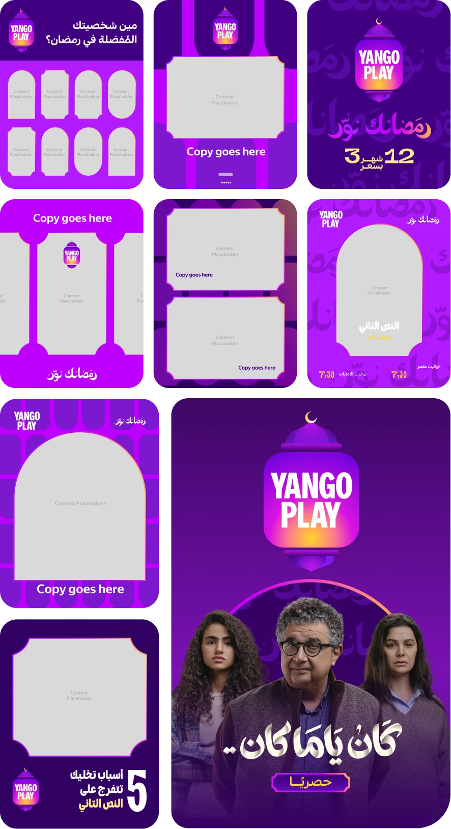
Activity calendar
Eight months end-to-end — four months of pre-Ramadan prep, five live phases on top.
Aug 261st meeting
Oct 29Project chat created
Nov 21Ideas presented
Jan 8Marketing brief
Jan
Feb
Mar
Celebrity / Teaser phase
Showcase breadth of stars on Yango Play
Announce early
Be the first to reveal trailers
Promotional phase
Build awareness of titles + posters across owned surfaces
Launch performance campaigns
Signal exclusivity around the headline stars and titles
Acquisition phase
Acquire subs and push the 3-day free trial Ramadan campaign
Rotate exposure across titles, optimise for Live TV push
Promote catch-ups and Live TV
Sustain phase
Reduce Ramadan churn with coming-soon titles
Binge-watch nudges + catch-ups
Start warming up the Eid lead
Eid campaign
Eid lead title push
End-of-Ramadan binge-watch reminders
Convert season churn into Eid retention
Meet the fanous
The first thing to know about Ramadan in MENA is the lantern — the fanous. A
small, glass-paneled lamp with a candle or a bulb inside it, hung in homes, carried by
kids, sold in markets, propped on iftar tables. Once Ramadan starts you see them
everywhere in Cairo and the Gulf — balconies, restaurants, street decorations,
packaging on supermarket shelves. It's to Ramadan what a Christmas tree is to
December.
The history is older than the holiday's modern look. In the Fatimid era, when the
Caliph arrived in Cairo, people greeted him at night holding lanterns. After that,
Egyptian kids started going out into the streets after Iftar with their own lanterns,
singing, asking neighbours for gifts. From Egypt the lantern spread to the whole Arab
world. By the time we got there a thousand years later, it was the one object that
meant Ramadan everywhere — Cairo, the Gulf, North Africa.
In 2024, when we asked what could anchor a Ramadan brand for an entertainment app in
MENA, there was only one answer.
Year two with the same anchor
We started small. In 2024 the lantern was barely visible — a crescent moon tucked into
the logo, more of a hint than a statement. In 2025 we went all in — turned the Yango
Play wordmark itself into a lantern shape, built a strong colour kickoff around it,
leaned hard on brightness and contrast so the campaign would read at a glance from a
moving car. That direction worked. It was the loudest brand we'd put into the region,
and the one that took bronze at the TikTok Ad Awards.
For 2026 my call was to keep the lantern but redraw the system around it — same
anchor, sharper engine. Doing year two right meant resisting the temptation to ship a
new symbol just because it's been a year.
What 2025 taught us
Year-two evolution started with three specific things we got wrong in 2025:
Cluttered
Every layout fought for attention. Big logo, big copy, big stars, big titles. We
were stacking five "look at me" elements into one frame because each had a different
stakeholder.
Fixed layout
The templates were too tight. As soon as a title needed a different aspect ratio or
a partner asset had to drop in, the system bent and the lantern motif drifted.
Inconsistency
Between the in-product version, the OOH version, the social posts, and the partner
integrations, the lantern showed up at different sizes, with different colour
treatments, and sometimes with the wordmark inside, sometimes outside.
The 2026 rebuild had to fix all three without throwing away what people had recognised
the year before.
Moving the spark inside the lantern
The single biggest design-system call I made on this project. Three changes:
I moved the spark inside
In 2025 our brand's spark lived outside the lantern silhouette — a small artifact
glowing next to it. As Yango Play's master brand evolved over the year the external
spark drifted off the rest of the visual language. So in 2026 the light still glows,
but it glows inside — the lantern becomes the source.
I reshaped the body squarer
The 2025 lantern was tall and narrow — beautiful close up, but it shrank on outdoor
formats and the logo lost legibility on billboards. I redrew the top finial and the
base to bring the silhouette closer to a square. That scaled the wordmark inside up
and made the same mark sit comfortably in both portrait and landscape layouts.
I split the lockup in two
One with the YANGO PLAY name visible inside the lamp, one without. I scoped the
wordmark-inside version for everywhere brand recognition mattered — OOH, paid
social, first-touch product surfaces. The clean version went in-product, where the
app context already signals the brand.
Everything downstream — the templates, the partner co-brand lockups, the splash
screen, the app icon — is built off this redrawn lantern.
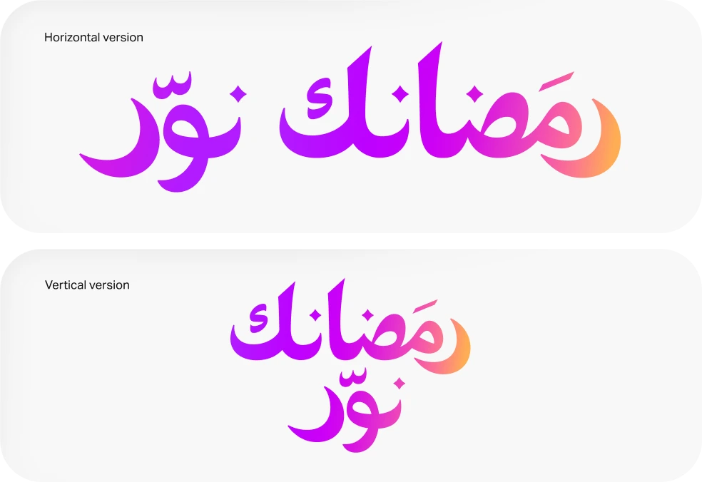
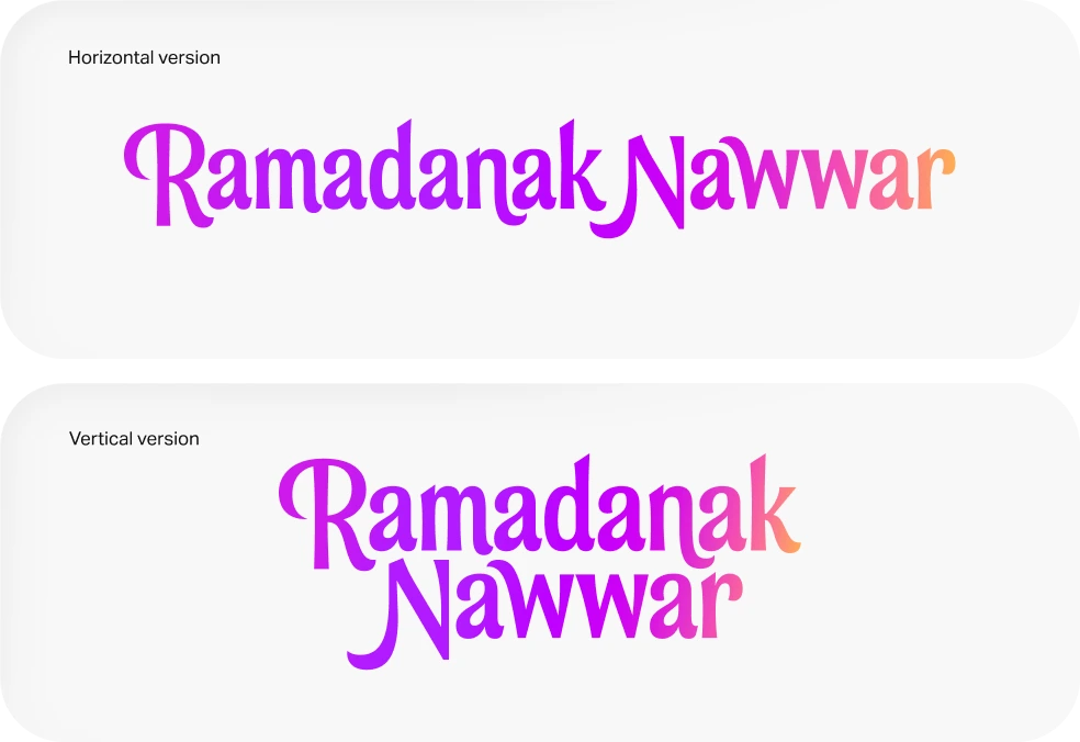
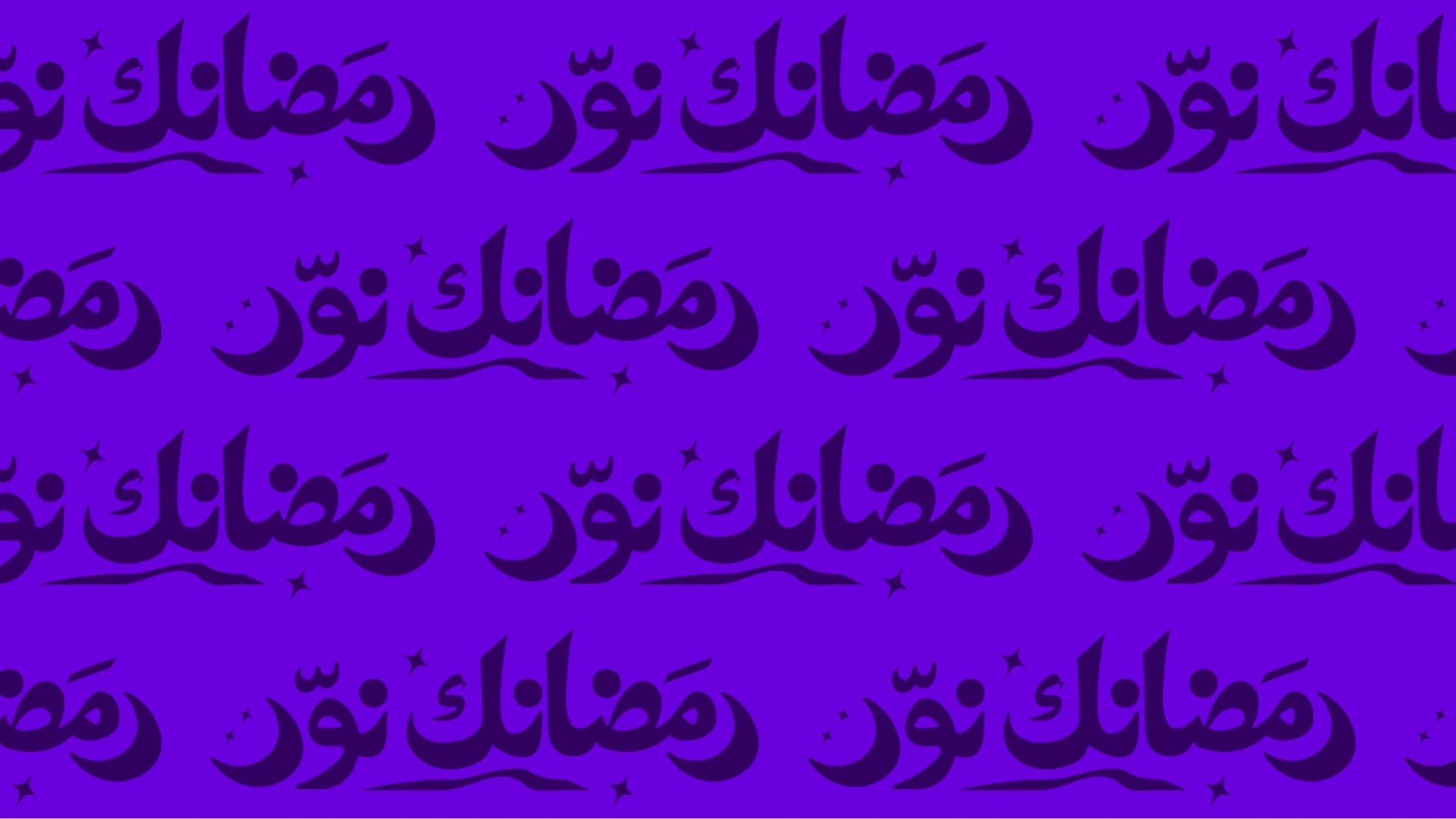
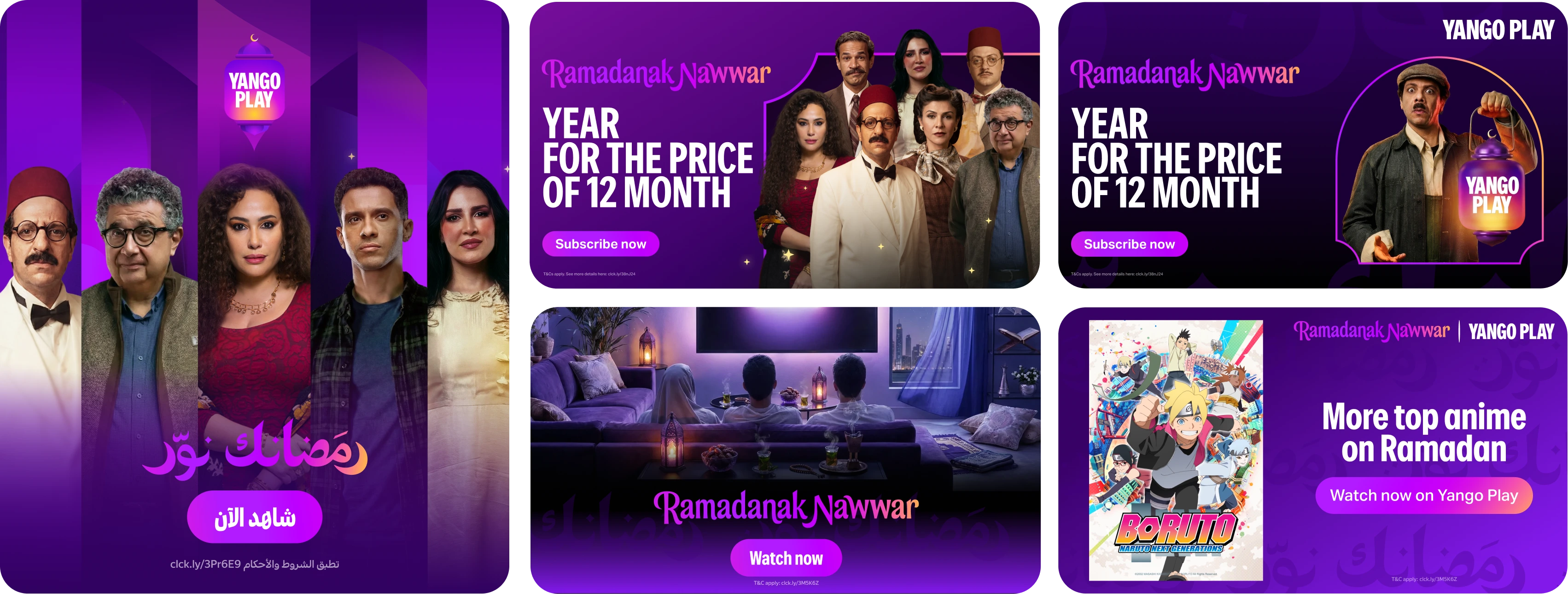
Ramadanak Nawwar — your Ramadan brought light
The tagline came from a single Arabic phrase. When a guest arrives at your home in
Arabic-speaking culture, you say "you brought light to the place." So instead of
saying "Ramadan is here on Yango Play" the generic way, we said
"Ramadanak Nawwar" — your Ramadan brought light — on Yango Play.
We commissioned the Arabic calligraphy as a custom piece, then drew an
English-language script in the same gradient to match — magenta running into amber,
the colour of the lamp's glow.
The tagline became the anchor element we needed — the brand could appear without our
logo in formats where the logo wouldn't fit, and still read unmistakably as Yango
Play.
The tagline doubled as a pattern. Tiled across a deep-violet field, it became the
background wash we used wherever the system needed atmosphere instead of content:
behind half-screen end-frames, between hero slots in social carousels, on
partner-integration washes.
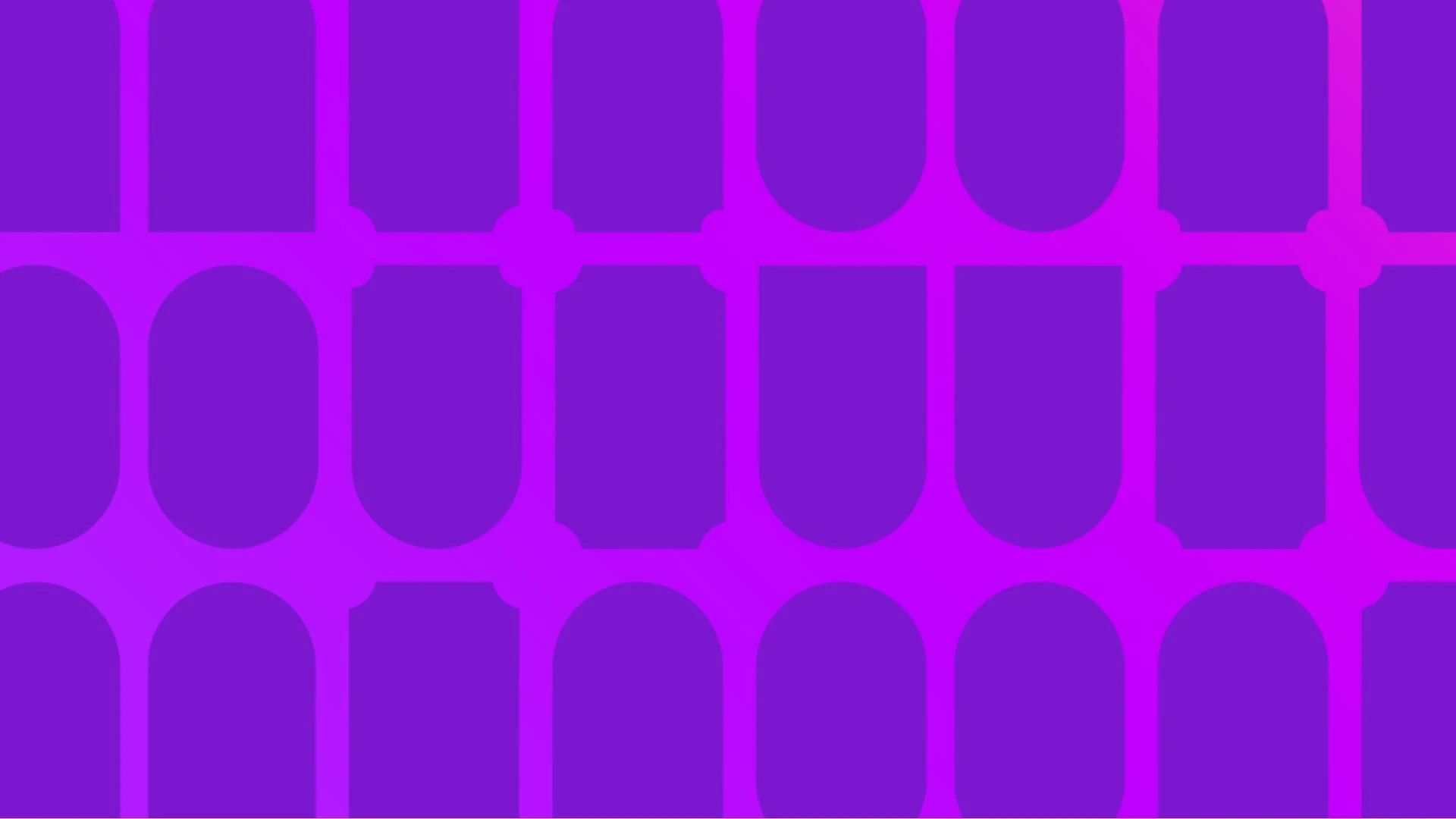
From street architecture to a layout system
The 2025 layouts had been built out of generic rounded rectangles. For 2026 I asked
the team to come back with a shape that carried cultural weight — not just a frame.
The research direction I pointed at was Mediterranean and Gulf street facades. Two
shapes kept repeating — an arch and a rectangle. Stack them, you get an arched window.
Repeat the arched window, you get the lattice that runs through traditional Ramadan
decoration. That's the form we landed on.
That became our second-act visual — the arch as both the photo frame, the content
placeholder, and the structural element holding the layout together. Posters lived
inside it. Cast portraits stepped out of it. The pattern wrapping the dark backgrounds
came from it.
One shape, applied across roughly fifteen template types covering OOH, in-product,
social, paid display, and CRM.
And just like the tagline, the arched window doubled as a pattern. Tessellated
straight or tilted at a slight angle, it gave us a second background variant — used in
product end-frames and OOH backgrounds where the tagline tile felt too text-heavy.
Lighting up the app
The brief here was deliberately small — don't reinvent the wheel, just move the
lantern from 2D to 3D. Adding volume and a real light source turned the launch
animation into a literal "lighting up the lantern" gesture across three moments
— home screen, app launch, ten-foot screen.
1 — The icon at rest
A flat magenta-to-amber tile with the YANGO PLAY wordmark. Designed to read at a
glance at thumbnail size, so it still earns a tap when it's competing with twenty
other apps in a row for a second of attention.
2 — The lantern lights up
The moment you tap the icon the flat mark unfolds — it gains volume, a real light
source switches on inside, the crescent settles on top, and the wordmark eases into a
3D body. About three seconds of "lighting up the lantern" before the app appears — the
same gesture the rest of the campaign builds on, just compressed.
3 — Ten-foot screen, same gesture
We scaled the exact same lighting-up animation for Apple TV, framing it in a
living-room context so the brand still reads when the viewer is sitting back on the
couch. No reinvention for the TV form factor — the gesture survives the scale.
Tiny moment — the kind users barely notice consciously, but the kind that decides
whether the brand feels alive.
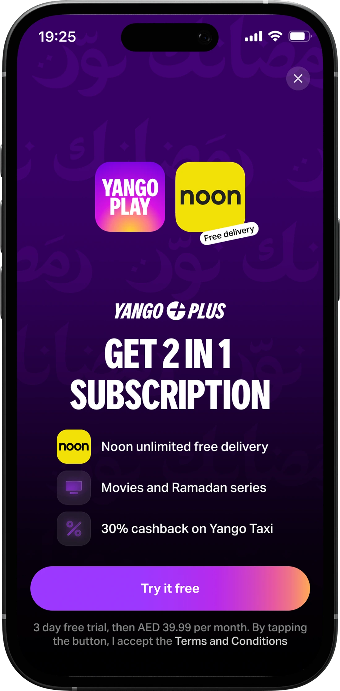
The paywall track
The paywall and product-activation track ran under my direction across the season,
designed and shipped by Anna Bugryi. Three pieces from it worth
keeping in this case:
Noon × Play (UAE)
A bundled subscription with Noon — three-day trial converting to paid. Short trials
in Ramadan worked because the audience came in warm. First-payment conversion
lifted, and 20% of UAE users we routed in-app via CRM activated the bundle.
Annual plan, everywhere except UAE
First-year conversion to annual landed at roughly 43% vs. monthly's 20% — a
meaningful lifetime lift. In UAE, where we couldn't ship the annual plan during
Ramadan, we pushed it as an upsell after the paywall instead.
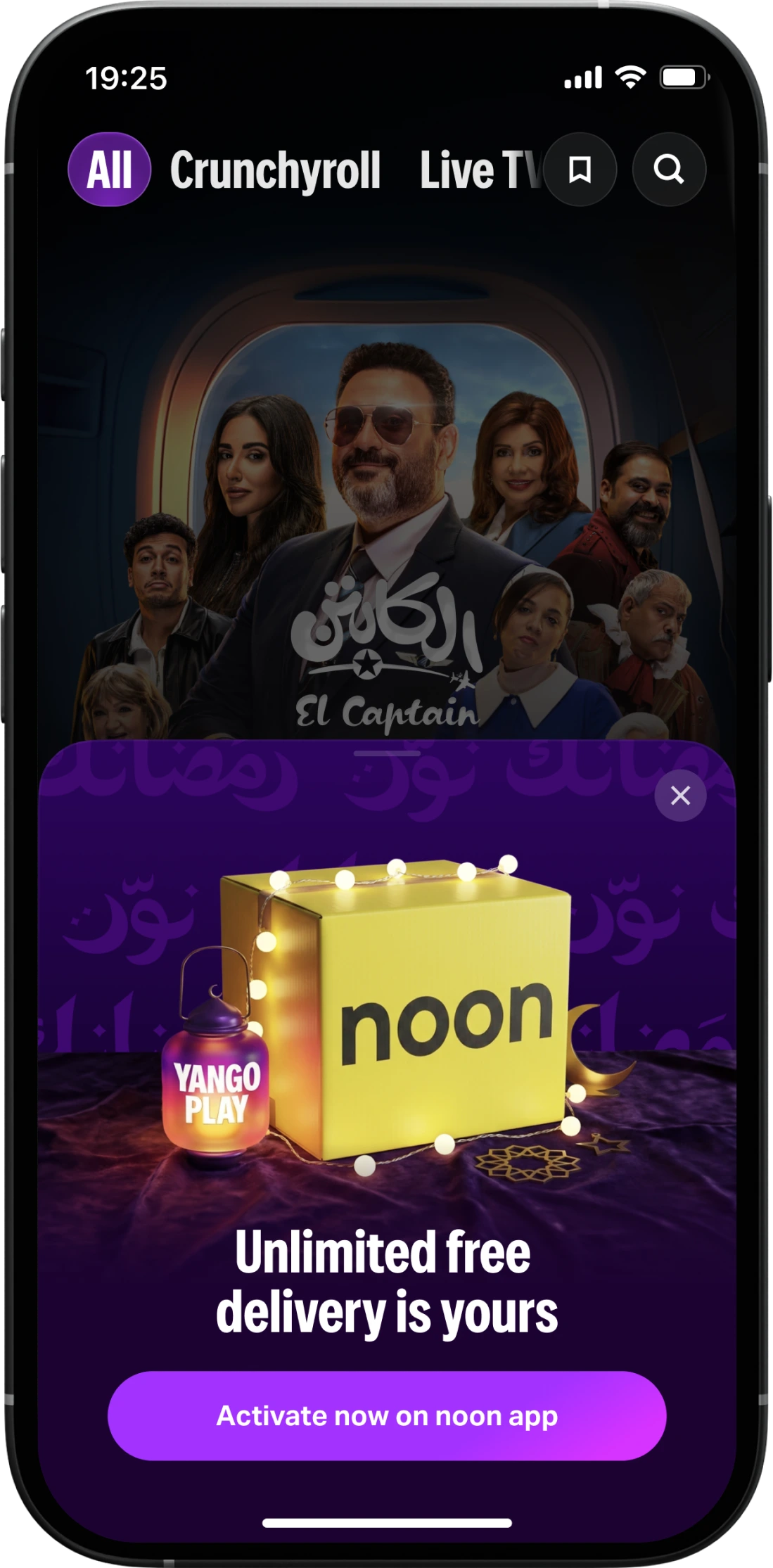
A lantern fortune-wheel mechanic
Instead of a static special-offer screen, users interacted with a lantern to reveal
their offer. Test group lifted the headline metrics over a static-CRM control — but
the long-tail outcome is that the interaction engine we built for the lantern is now
reusable across any future promo mechanic. The bigger thing we shipped was a piece
of technology, not a piece of creative.
Full case study →
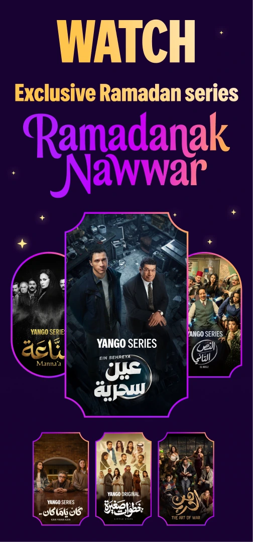
688 faces in groupings, singles, and key-art hero stacks
ASO
New base pack + 10 Custom Product Pages (Watch / Anime / Listen split). Installs +98%,
conversion +22pp.
CRM
100+ outside-the-app, 90+ in-app placements. UAE mobile +8.6%, cross-market +1–4%.
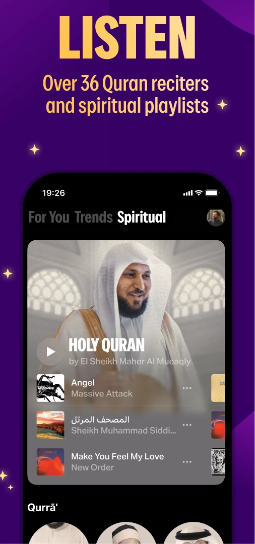
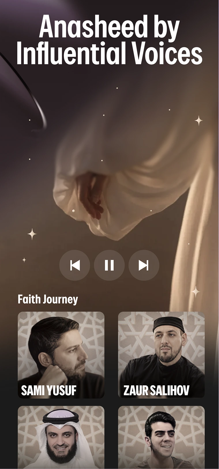
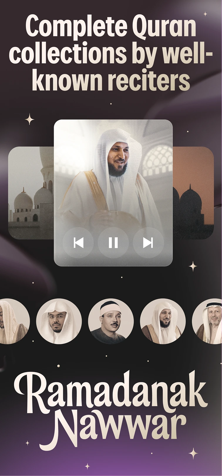
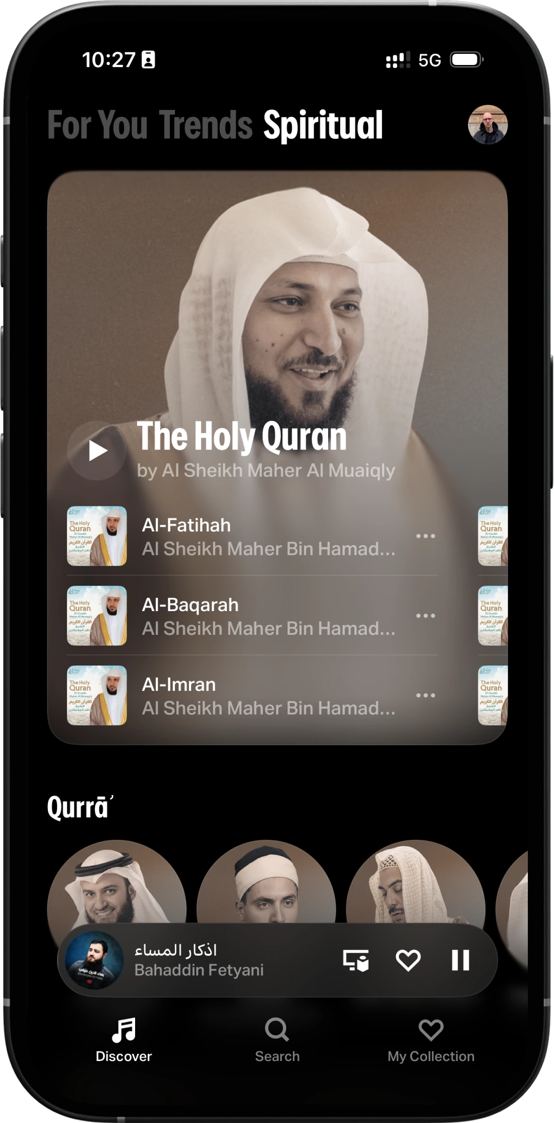
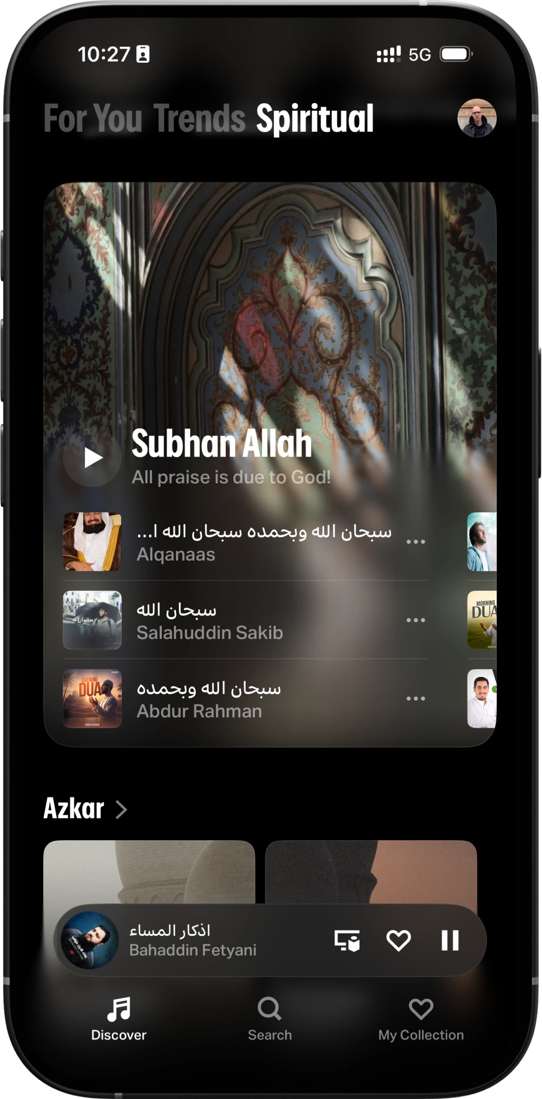
Yango Music — Spiritual showcase
30+ reciters + ambient sounds (rain / water / forest). Usage +27.5% during the month.
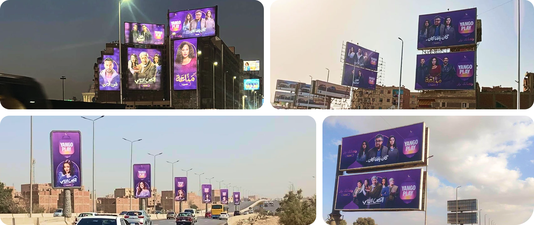
Performance adsOut-of-home — Egypt
ASO Custom Product Pages — Ramadan Purple
ASO Custom Product Pages — Ramadan Spiritual
CRM placements
Yango Music — Spiritual showcase
Results
What we shipped, in numbers:
75%
of an aggressive subscriber KPI hit
+33%
Ramadan-month revenue, YoY
+253%
total watch time, YoY
+41%
design output during the ramp-up
Where we fell short
We landed at 75% of the headline subscriber KPI, not 100%. The gap wasn't a
creative-quality issue — every test we ran against the 2025 baseline lifted. It was a
paid-media reach problem in Egypt, where we underweighted spend relative to UAE. The
system can scale further. Year three the spend mix has to catch up.
The campaign is also the design substrate for the team's 2026 TikTok Ad Awards
submission. The documentary teaser at the top of this case is the submission video.
What made it work
Three things, by my reading of the wash-up after Eid:
Early kickoff
We started in August — eight months before Ramadan went live. That wasn't ambition,
it was learning from 2025, where the last six weeks had been a controlled fire.
Starting in August meant the first thirty deliverables landed before December, the
system got pressure-tested against real content in January, and the on-ground OOH
installations happened on schedule instead of on adrenaline.
V-team model
The same group of people from product, design, content, marketing, and operations
met weekly throughout the campaign with single owners per surface. No design review
existed in a silo. No marketing brief landed without a designer in the room.
Two teams, one Zoom
The least quantifiable but most personally satisfying piece. Russian-speaking design
talent in Moscow and Arabic-speaking design talent in Dubai sat in the same calls,
made compromises on taste with each other, and produced a campaign that felt unified
despite being authored across two timezones, two languages, and two design cultures.
Not every multi-region team gets there. Ours did.
The lantern, the tagline, the arched window, the fortune-wheel engine, the spiritual
showcase on Music — none of these were one-month assets. Eid 2026 ran on the same
system. Ramadan 2027 will too.